

I finally branded my substack
Or: a graphic designer tricking herself into sharing her posts more.

When I started How Absurd, I chose not to design it. The lack of design was the design, a quiet protest from someone who spends all day building worlds for others.
It felt good for a while. Plain, anonymous, like a white wall I could write on.
But when strangers started following, I realized I do care and the reason I wasn’t sharing it was obvious. I’m a designer, after all. So I gave myself one night to make it real. No moodboards, no strategy, just instinct and an imaginary 5 hour deadline.
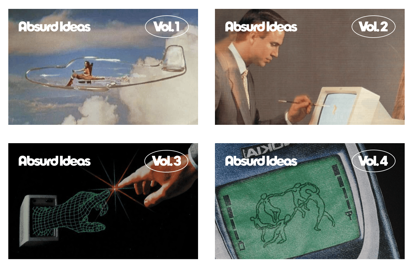
I kept thinking about the odd beauty of old images that tried to predict technology, the ones now stuck in a sort-of uncanny valley. Familiar, but not quite what became:
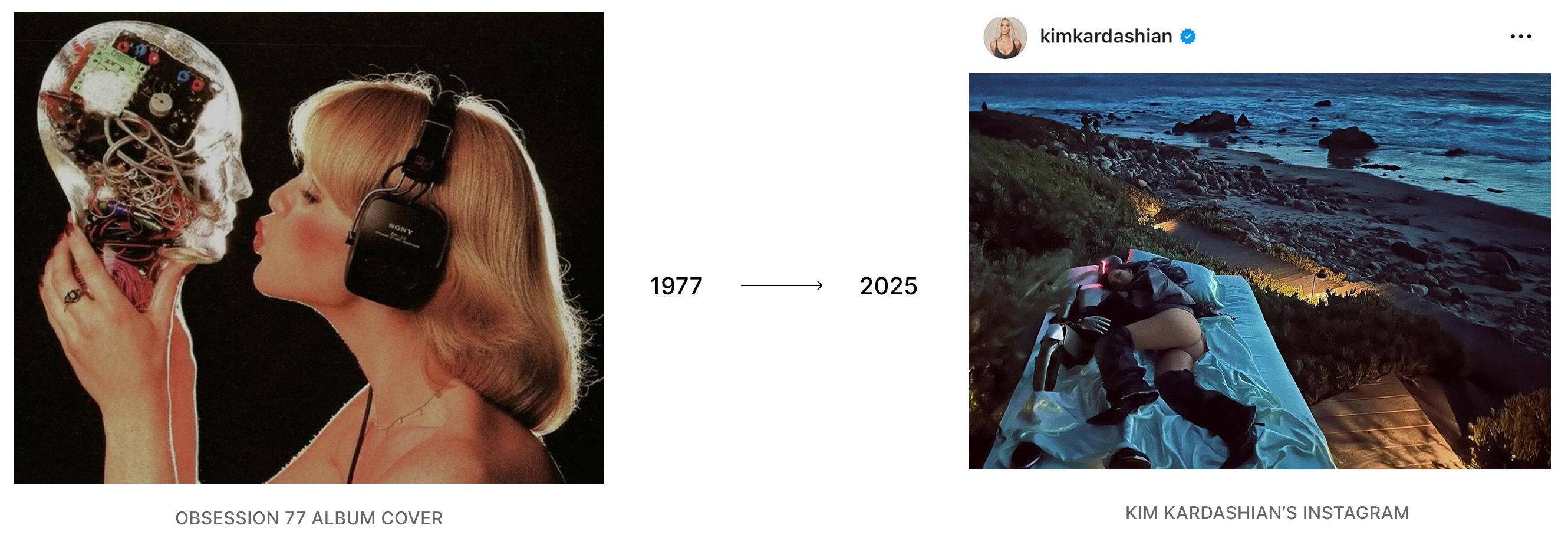
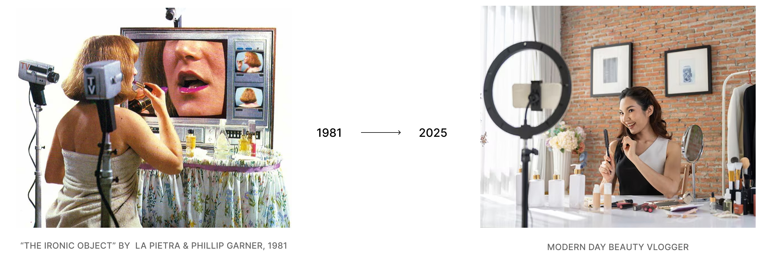
Popular Mechanics imagined flying cars, IBM promised an electronic brain, and Clueless gave us the dream of a digital closet (which I still want.) There’s something tender about that old optimism, when the future felt magical and a little mysterious.

That became the direction. A retro-futurist world built from 80s CD-ROM packaging, and the glossy corporate hope of early digital design. The kind of aesthetic that once thought the future meant brushed steel, gridded horizons, and robots that actually looked like robots, instead of the LLMs we talk to now.
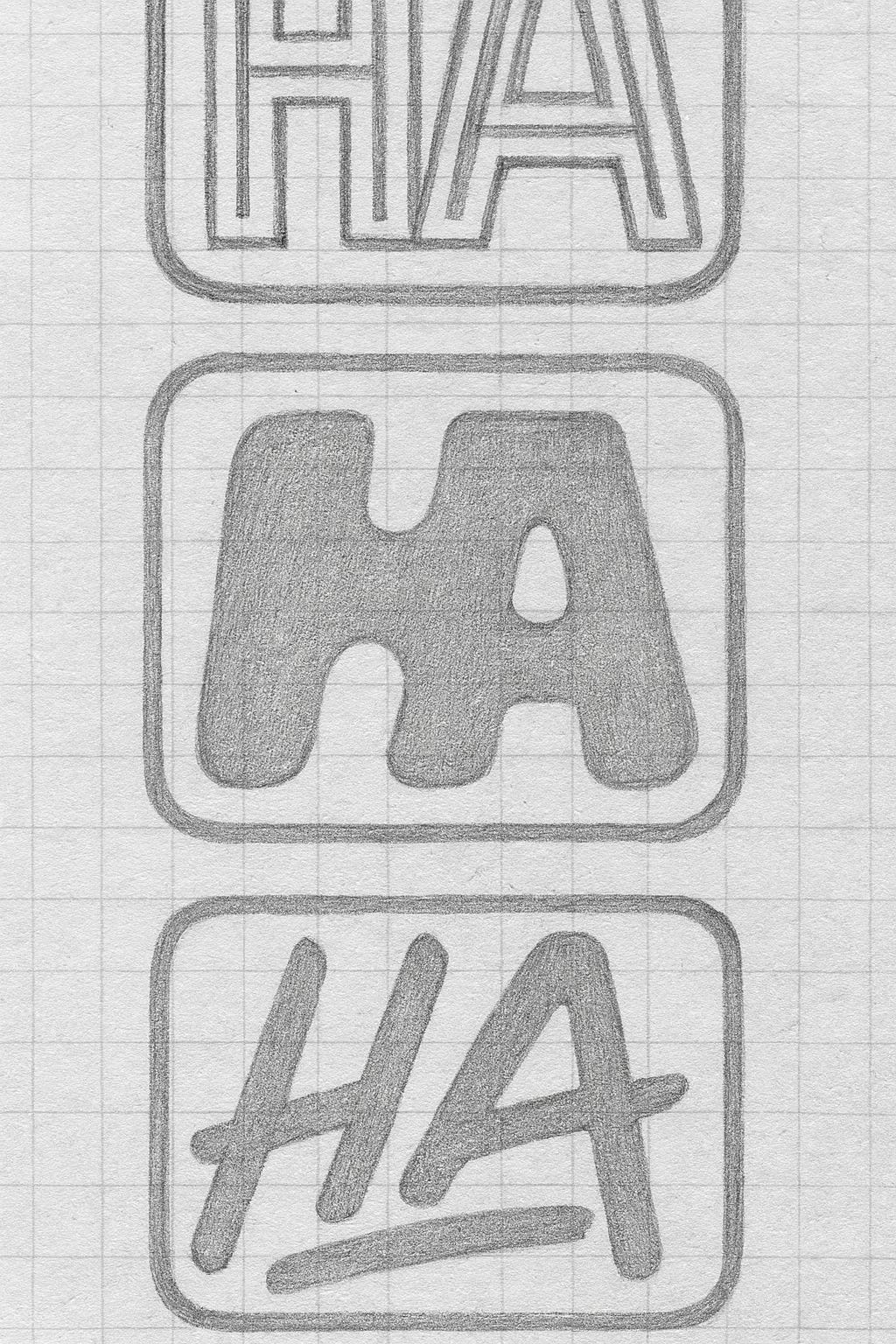
The logo mark came easy: HA. When stacked, it becomes HA HA HA. A refusal to take this too seriously. And all in the default unvisited link color, an homage to internet rabbit holes.
The imagery is inspired by the era that dreamed forward. It’s not parody, it’s a quiet affection for the sincerity of those wonder-filled predictions.
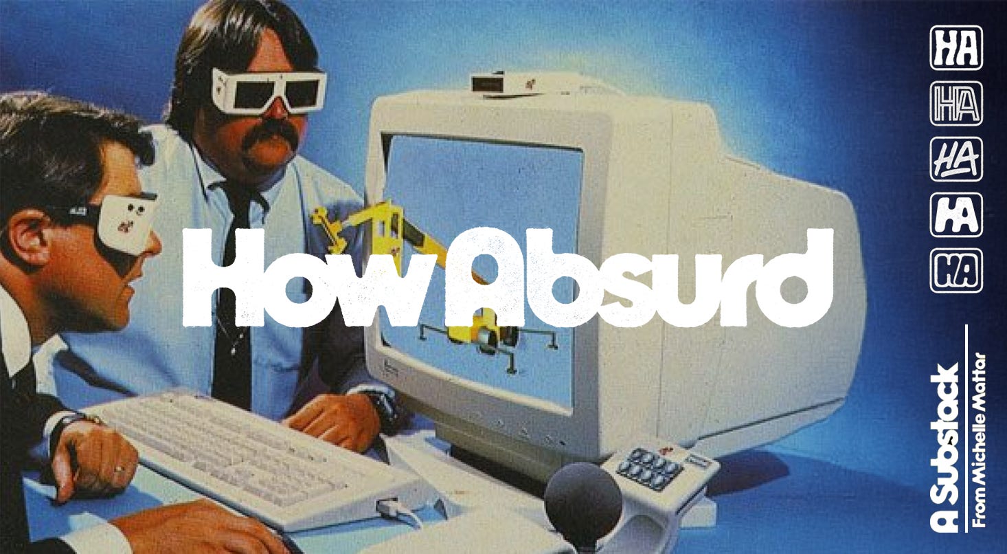
I wanted How Absurd to feel like a space I’d actually want to write in: curious, observant, self-aware, a little unserious. So here it is. Nothing grand, just a quick new look and a small explanation. After a year of long, complex projects, the exercise felt like booting up an old computer just to see if it still works.
Love it!
loveeeeee the little HA iterations